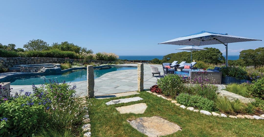
In the mid-1990s, the legendary country realtor Dave Flanders gave a new client “the bucket treatment.” Chilmark’s north shore was still relatively underappreciated by seasonal residents compared to its southwest facing coastline and, eager to show the sort of view rarely available along South or Middle Road, Flanders stowed his prospective buyer into the front loader of his tractor and raised him twenty-four feet. From that height above the scrubby trees on Prospect Hill, he could see the wooded, viny fields sloping down to the shores of Vineyard Sound and the Elizabeth Islands in the distance. It was the same technique Flanders used in the 1960s to help Jacqueline Kennedy Onassis survey the land that would one day become her Red Gate Farm.
“The bucket did the job and Dave took care of the rest,” the buyer recalled recently. Flanders kindled a neighborly relationship with the abutters by supplying them with firewood from the clearing that took place – clearing which also incidentally enhanced the neighbor’s water views and eased any opposition they may have otherwise had to the inclusion of a second story in the new house design. Twenty-five years later, the husband and wife remember the transaction as “Vineyard magic.”
Soon, architect Tom Tate was at work on a mill-style double-silo structure while the couple, who are both trained pilots, surveyed the progress of their new home from their Citation jet. Having their own jet made travel between their corneal surgery and eye care practice in New Jersey and the Island easy and fun. Once the home was finished, they almost never missed a weekend sharing their expansive view from Cuttyhunk to Aquinnah with family and friends. “I never thought you could watch the march of time,” recalled the owner, noting the way the sunset moves dramatically over the course of the seasons. “But the view on this property is as close as you can experience.”
They loved the house, but with the inevitable blows and battering from the elements, time took its toll. As with dog-years, twenty-five Vineyard home years counts for more. The windows and doors needed replacing, and, with the addition of grandchildren, the owners looked at the house spatially and saw the need for change. But, most of all, they realized that their taste and lifestyle had evolved. With the certain need for renovation, it was a good time to reassess the whole house. “Our aesthetic had changed. We were ready for something more contemporary,” they said.
So began the conversation with two seasoned Island professionals: architect Chuck Sullivan and designer Annie Parr. Sullivan + Associates Architects originally built its reputation updating the aesthetic in Oak Bluffs, bringing its historic Victorians into a new era. More than twenty years later, Sullivan has made a lasting mark on the Island with home designs reflecting the unique character in each of the Island’s six towns. “This property just off North Road with fields spilling down to the shore was among the most beautiful I had seen,” he recalled, “and the renovation presented the challenge of building on the elements that had been lost in time.”
Parr had worked with the family since they first happened upon Island Interiors, her studio in the Oak Bluffs Arts District, in search of a pair of pillows. Over fifteen years of regular updates and projects, Parr earned the couple’s trust and their respect as she built and broadened her business – now rebranded as Annie Parr Interiors, LLC, based in her Chilmark home where she works in a designated studio space. “Like most renovation projects,” Parr said of this latest collaboration, “it begins with one idea and then they got hooked on the excitement.”
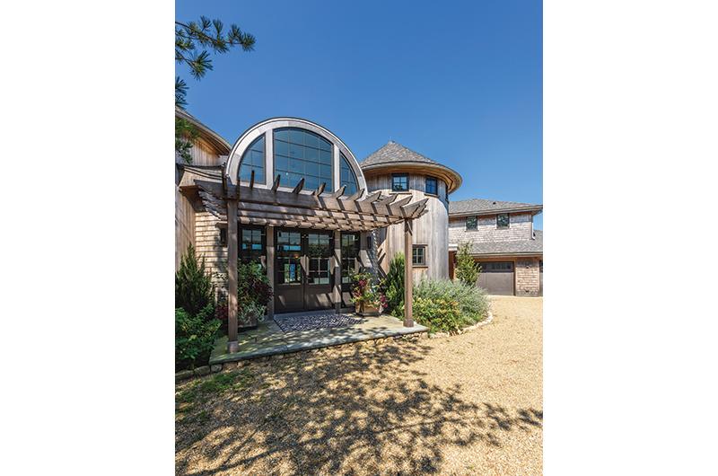
The circular profiles of the original house presented the biggest design challenge. Both Sullivan and Parr wanted to celebrate the silo’s circular feature, open the house to the views, and optimize the livability. But it was Parr’s vision of “French industrial meets the beach” that drove the project, starting with the update of the dramatic arched window entrance connecting the two silos. The addition of vertical pane casements within the curved glass now reflects the tree canopy and teases the view of the waterside horizon. Small custom “bird peep” windows climb the matching turrets, bringing a touch of whimsy and light from the other side.
Just to the left of the entrance foyer is more inspiration from the rounded form. A barn door slides open to reveal a custom bar with curved counters framed in a strong industrial tile design. No inch is wasted for stowing liqueurs, fine crystal, or red plastic tumblers. Parr calls it “spirits in the silo.” A small window allows the bartender to slide up the sash and greet guests with the sound of an icy shaker before they cross the threshold.
It took some convincing to change up the second silo from its original function as a second-floor home office to a laundry room in the round. Again, a sliding door disguises the washer, dryer, shelving, and utility surfaces when not in use and can open to commanding views across to the pool when folding towels. It was one of the biggest surprises for the family, who were thrilled with their new scenic laundry system.
Sullivan’s plan to “repurpose the intent of the silos and take away the late-nineties feel with an industrial look” extended to the staircase and interior and exterior balconies. One of the biggest challenges was the assembly of the cable railings up the circular steps. He and general contractor Jay Napior chose a quarter-inch rod that was bendable on site to accommodate the sweeping turn. Cable balustrades are a signature of Sullivan + Associates Architects, and this project showcases the airy results as the balconies inside and out almost disappear against the landscape.
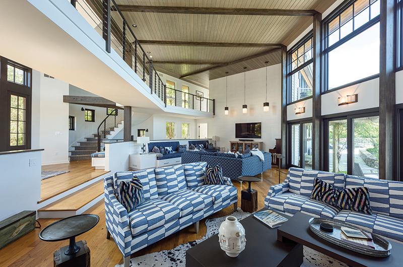
The open balconies also remedy a disconnect between the first and second floor and open the sunken seating of the great room to slanting sunlight. “My objective was to divide and conquer the challenges of an asymmetrical floor plan by creating a contemporary boutique-hotel-feel lounge,” said Parr. Family and guests have three interesting and comfortable options for conversation, binging on television, or summer reading. The mix of fabrics and patterns in marine and lighter blues shows Parr’s eye for handpicking textiles for her custom furniture, while their design highlights her respect for the practical. Underneath the comfortable seating are full-length drawers assigned to each grandchild for quick stashing of toys and to easily transform the large living area into an adult cocktail space.
The room opens to the outdoors through sliding doors onto the stone and granite exterior. The formerly oval upper picture windows were squared off and topped with four-over-four vertical panes, echoing the front entrance, to frame the Island’s ever-changing firmament. On their first visit to the renovation project, the owners were “blown away” by the transformation, which opened to “views we had never really paid attention to before.”
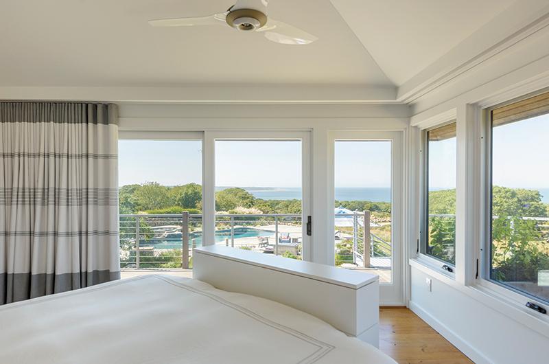
Parr’s objective was to make the home “easy and accessible for two, and friendly and comfortable for fourteen.” The addition of a guest suite over the garage next to the master bedroom essentially divided the house into an east wing for the owners and their guests and a west wing to accommodate their two sons and their growing families. Like every aspect of the project, once a wall came down, a new idea came up – the master bedroom and bath being the most dramatic of the “before and after.” Sullivan remembers, “Originally, the master bathroom had the best view in the house across the Sound. The renovation flipped the bathroom and the bedroom to dramatic effect – creating an angled bed wall and open sitting room.”
For the extensive re-do, the house was stripped of every possession, down to the kitchen utensils. As the pandemic took hold, the owners trusted Parr to move forward in their absence, which included making paint choices. Parr is an expert at creating custom paints and glazes that she says allow her “to cover surfaces in one pass for easier and palatable results.” She chose a gray wash for the beams and a special glaze for the tongue and groove ceiling boards to produce a kind of industrial chic feel. The “decorator-white” walls used throughout the house continue into the kitchen to absorb the light. Parr chose Evening Dove by Benjamin Moore for the cabinets so as not to compete with the backsplash and the view of water and sky. The kitchen island, which she describes as her “signature anchor of color,” is painted a custom blend of graphite paint with a matte finish.
The greatest leap was no doubt committing to the 427 yards of fabrics for the custom rugby-stripe window treatments. “Looking back,” Parr mused, “when the yards and yards of fabric arrived at my studio, I knew I owned it – no matter what happened!” She did own it, and, with a team, she sewed it to create the indoor-outdoor drapes and shades that grace every room.
At the end of the two-and-a-half-year renovation – with work interrupted by the pandemic – the house was back on schedule and the owners were back in the seats of their Citation, arriving on Friday afternoons with lunch from a New Jersey deli to share in the results of Parr’s creative vision.
To no one’s surprise, Parr’s energy and vision were evident in every aspect of the finishing touches, including colors, custom furniture, light fixture choices, and custom curtains. Even every piece of flatware was back in its proper drawer in the kitchen.
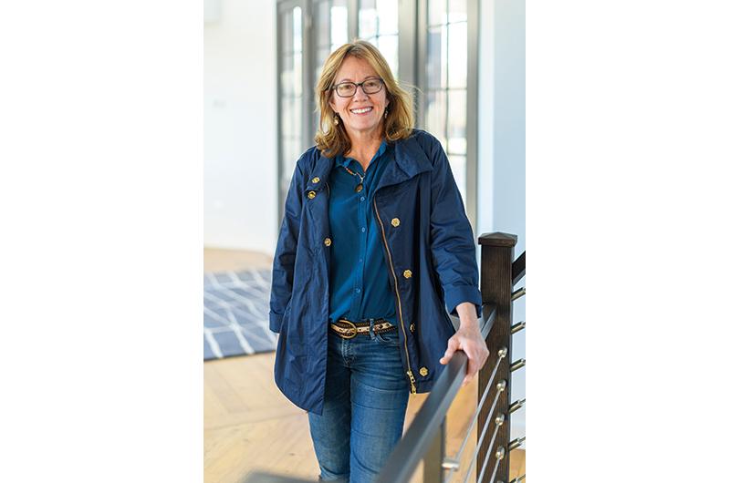
“She is a jack of all trades,” they said of Parr, “and a master of all!”

