Sandra Schpoont and Steve Axelrod were outgrowing their summer home on the North Fork of Long Island and had been renting on the Vineyard for a number of summers. They haphazardly followed the real estate market and toured a few homes, but nothing clicked until the very house they’d rented for one month, in July 2014, a historic farmhouse on Middle Road in Chilmark, hit the market.
“It was a summer house, we knew it needed a lot of work,” said Schpoont in a brand-new kitchen. “We didn’t know it would be a complete re-haul.”
Axelrod, a psychologist, and Schpoont, a New York–based attorney, enlisted Island architect Chuck Sullivan, of Sullivan + Associates Architects in Oak Bluffs, and husband and wife design team Keren and Thomas Richter, of White Arrow in Brooklyn, to realize their dream of a thoughtfully preserved Island home with a modern flair. “I love design,” Schpoont said. “I didn’t want a Cape Cod type of house. I wanted something cool.”
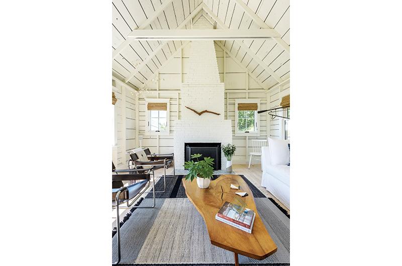
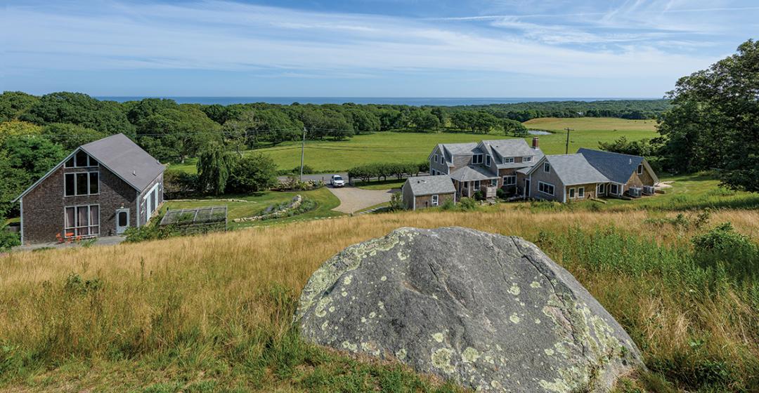
The house sits at the bottom of a steep ridge with sweeping southerly views. From a sunny sitting room that was once a makeshift post office, a row of windows showcases the agrarian magic of Keith Farm across the street: cows graze, birds flock, and, a little farther, waves crash. Save for the occasional car traveling Middle Road, it could easily be another time in Island history.
It’s a recognizable property for anyone who’s spent time traversing up-Island, and it’s not uncommon for dog walkers and joggers to stop on their way past. If Schpoont or Axelrod are in the yard, someone might let them know that they appreciate the preservation work they did. But for all the preserved glory of the exterior, what those passersby can’t see from the road is that the interior is a modern showpiece, curated to meet the needs of a professional couple.
The original layout was choppy, with lots of little rooms and not much in the way of flow. There was no proper entryway or gathering space. “It was a classic New England house,” architect Sullivan explained. “It was added onto over time. So we reconfigured what was there first and then added on.”
Though Chilmark does not have a designated historic district, the project was reviewed by the town’s zoning board of appeals and the historical commission. “We really had to reassure the town that we would maintain the integrity of the house and that it wouldn’t look brand new,” explained Schpoont. In no small feat of architecture, the addition on the back, built by Jared Kent and Thomas Van Hollebeke, of Kent & Van Hollebeke Construction, is barely visible to the road yet provides the extra first floor living space – a master bedroom, pantry, office – the couple wanted.
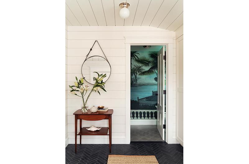
The main entryway – once two separate rooms with doors off the original kitchen – now leads to an oversized mudroom, a bathroom, and an entry porch carved out of the interior space. Black herringbone tile and white clapboard walls signal a design theme that continues throughout the interior. It’s a study in contrasts: old and new, dark and light, functional and fanciful. The bathroom features stunningly bold wallpaper that is both tropical and moody. The white granite sink, set in a surprisingly industrial base, is just minimalist enough to let the wallpaper be the main event. In the living room, meanwhile, there is something to look at in every corner. Interesting furnishings in unexpected hues draw you in: a shin-height coffee table, an indigo-dyed canvas couch, and a vintage Moroccan tuareg rug.
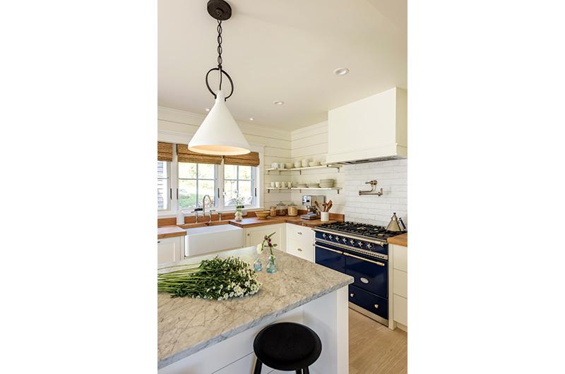
Months before the sofa was placed just so on that vintage rug, designer Keren was in Brooklyn visualizing the project. Her goals, she said, included achieving a space that was refreshing and warm, intuitive and embracing. She imagined a modern dialogue in which the history of the home was still visible through a contemporary lens. Together with her husband Thomas she found a mix of unusual fixtures that were chosen to make the space feel fresh: a chic Bert Frank pendant light in the kitchen, a canopy bed in the master, an aqua velvet sofa in the office. The Richters stayed in the house for a mini vacation once it was finished and they relished the opportunity to see the space at different times of day.
“The way the light hits in the evening is magic,” Keren said. “Everything glows. It came out really, really beautiful.”
A kitchen, now relocated to an area of the house that was once used as closed-off living space, has been opened up to capture beautiful Island light. White subway tiles as a backdrop to the Lacanche range provide just a slight sparkly diversion from the white clapboard that continues from the mudroom. Butternut wood countertops are as attractive as they are functional, and a white/gray marble island roots the room in a gathering space.
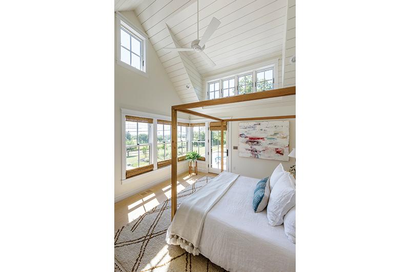
From here, the tour of the original house ends and the addition begins, starting with an immaculate pantry of glass jars and porcelain bowls. The sunshine-filled hallway ends with three tiny steps to the master suite, which includes a his-and-hers office space, dressing room, and, finally, a bedroom. Vaulted ceilings in the bedroom let in more light and create a breezy, roomy feel. To rein in that openness and add more intimacy, the canopy bed creates a space in and of itself. In the study, richer, darker tones create a homey space where Axelrod and Schpoont can work, read, or kick back and watch a movie on the velvet sofa. Upstairs, guest rooms are clean and sparse with rugs that Schpoont brought home from a trip to Morocco.
Equal attention was paid to the landscape, which had its own challenges. After walking the property, getting to know the curves and hillsides, dips and peaks, designer Barbara Lampson of Tisbury said she approached the landscape design with four considerations – the architecture (a farmhouse with modern sensibilities), the genius loci (spirit of the place), Axelrod and Schpoont’s taste (lush but no fuss), and the views (rural and sea). It helped that Lampson grew up nearby in Chilmark and has long admired the property.
“Steve and Sandra bought that house because they love Chilmark and the informal feel of Chilmark,” Lampson said. “We wanted to keep it historic and natural feeling.”
She was thrilled to have access to the historic stone on the property, some of which she used to create a new walkway from the parking area to the entry. And while she usually aims to keep her landscapes consistent throughout
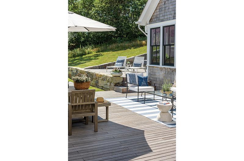
a property, in this case she kept the visible front of the house simple: ancient crab apple trees, a stone pathway, native plants in keeping with the historic character of Middle Road. In the back, on the other hand, she “moderned it up” with a patio and herb garden in close proximity to Axelrod’s pizza oven.
“Sandy is really the garden person,” said Lampson.
“She didn’t want anything high maintenance, but she does love to garden, cut herbs, and pick blueberries.”
Behind the house, fieldstone steps lead to the peak of the property where a deck awaits, perfect for coffee in the morning or wine and snacks in the evening. From the deck the visibility expands. If the view from the old post office sitting room with the Nakashima coffee table is enjoyable and cozy, this is breathtaking and perspective altering. The quiet is palpable from that deck; it’s a place to sit, chat, maybe read, but nothing more.



 1 comment
Comments (1)