This past February modernism aficionados packed the Palm Springs Art Museum to hear Boston architect Frederick Noyes lecture on the career of his late father, Eliot Noyes. The event was a highlight of Modernism Week, the eleven-day design symposium, now in its twelfth season, that attracts 80,000 national and international visitors annually. A prolific New England mid-century modern architect, the elder Noyes designed scores of houses, office buildings, and corporate interiors, along with dozens of industrial products. Often assisted by his wife, Mary “Molly” Noyes, herself a trained architect, he became a leading designer for major American corporations. For IBM, he designed not only the iconic Selectric typewriter, but virtually every aspect of the corporation’s visual culture, coordinating graphics, interiors, and even the uniform suit attire of their white-collar executives. He did the same for other corporations, such as Xerox and Mobil Oil, where he not only redesigned
gas stations but reworked traffic patterns and implemented new signage.
In his own time, however, Noyes wasn’t well known. “As recent as ten years ago he was not recognized fully for all he had achieved,” said his son Frederick. “He was considered a secondary figure to the Philip Johnsons and others. Now people say he was in fact a leader in design. Johnson even called him the lodestar of the Harvard Five,” a group of influential architects associated with that university who in the mid-twentieth century designed houses in the New Canaan, Connecticut, area. All the more remarkable, therefore, that there are four houses designed by Eliot and Molly Noyes on the Vineyard today, all of them intact in a way that would make fans drool as they did when viewing images of his work at Modernism Week.
The couple, with four children between the ages of three and thirteen in tow, first traveled to the Vineyard in 1955 at the invitation of their friends Erik and Vibeke Simonsen, who had rented in Chilmark for years. Though it’s hard to believe now, Chilmark at the time was an attractive destination for young families because it was both inexpensive and relatively undeveloped, with fewer than 200 year-round residents scattered over some twenty square miles. There were very few summer homes.
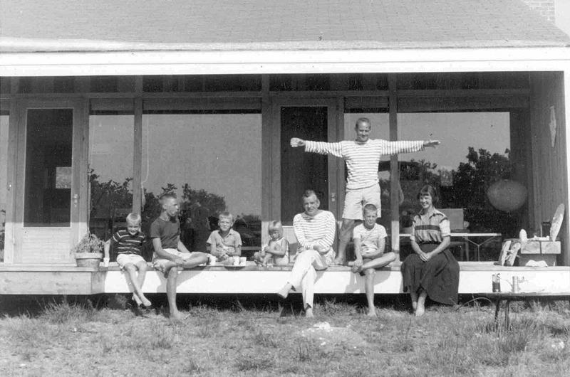
“It was a very different time,” remembered Frederick. “Very relaxed. There was kind of a joke that if you brought more than two pairs of shorts you were going to be overdressed. So the idea that there would be fancy parties, cocktails, whatever, was not the thing. The beach was a daily affair. Catching the surf, Lucy Vincent, boating, sailing the pond, fishing up and down the channel in Menemsha. That was the orientation of summer.”
The community, made up of long-time farmers and fishermen with their small inventory of vernacular barns and shacks, also represented a desirable aesthetic milieu for modernist designers to explore. Chilmark was not seen by the newcomers as overly restricted by association with any specific style, the way Federal-style Edgartown or Victorian Oak Bluffs were and are. As such it presented a blank slate in terms of social and architectural possibilities. Martha’s Vineyard as an overall destination was also relatively easy to get to from New York and New Canaan, with trains that went directly to the Woods Hole ferry. After sharing a pleasurable summer with the Simonsens, the Noyes family decided to look for land to build their own house, which they completed the following year.
Mid-century modern architecture is not particularly abundant on the Cape and Islands, but in recent years it has been a subject of renewed interest. In 2014 the Cape Cod Modern House Trust produced Cape Cod Modern, which described the arrival of significant European masters in the 1930s who went on to spend decades summering in Marion, Wellfleet, Truro, and Provincetown. Architects Walter Gropius and Marcel Breuer and designers Herbert Bayer and László Moholy-Nagy were among a cadre of artists, writers, muses, and patrons who, fleeing a hostile Europe, settled in the States, where they sought to introduce their version of modernism. The Cape was a convenient haven where they could gather to share ideas and promote this new movement through academia, the arts, business, and culture, and they referred to those early retreats as the Summer Bauhaus, after the East German school they had been forced to abandon.
Noyes and his wife developed their own thinking about modernism, studying and working with these masters in their student years. Noyes had been at Harvard in the early 1930s when it still had a Beaux Arts architecture program. He took an early break from college to work on an archeological dig in Iran, and when he returned Gropius and Breuer had been hired to replace Harvard’s classical program with a modern curriculum. Molly attended the Cambridge School of Architecture for Women, which was directly affiliated with and located near Harvard College. Although she did not have direct access to the Bauhaus teachers, the school followed Harvard’s curriculum strictly. As such, she also became an ardent modernist.
Modern Bauhaus theory called for essentialism in design, which was defined as the examination of inherent qualities of space, materials, light, and color in the creation of functional objects or buildings. In somewhat marked contrast to today’s Vineyard of historic district commissions and officially approved window treatments, its proponents rejected overt historic references. They tended to embrace vernacular buildings and objects because of their functional nature, looking to simple cottages, farm buildings, and fishing shacks to inform their work. Noyes also ascribed to the Bauhaus practice of total design, creating a coordinated relationship between architecture, product design, painting, and sculpture. Most importantly, he and his generation of designers and clients took from the Bauhaus an ethos that went beyond the quest for a new aesthetic. Rather, they saw modernism as a way to reconceptualize culture and society; to examine how people lived and worked, and then to design objects, buildings, and entire environments that would make lives better.
Early in his career Noyes was the director of the first Department of Industrial Design for the Museum of Modern Art (MOMA) in New York, a position that introduced him to many emerging designers with whom he would continue to work all his life. (While at MOMA he held a design competition that yielded the famous Eames chair, a design that revolutionized American furniture.) But his most important collaborator was always his wife Molly, who on both corporate and residential projects often took responsibility for space planning, material choices, and color palettes. “She had an amazing eye,” said Frederick. “She had good instincts. She was of great use to my father, giving him feedback.”
In 1955, one year before breaking ground on their home on the Vineyard, Noyes completed a home for his family that is now considered his “masterwork.” Located on Country Club Road in New Canaan, Connecticut, it epitomized his approach in assigning form to function. In it Noyes used an efficient, lithe structural system and straightforward materials to create essentially a container for daily living. The plan called for three nearly equal rectilinear volumes, and the private bedroom and bathroom area were separated from the public living and dining spaces with an outdoor central courtyard. The family literally had to go outside – rain, shine, or snow – to cross over from the public to the private part of the house if they needed to use a toilet.
This forced engagement with nature became a defining element of Noyes’s work. Another recurring feature was his use of two solid walls, in this case in masonry, to frame two glass walls to establish the overall building form. The solid walls acted as a protective barrier to the street or public view, while the glass walls opened individual rooms to the natural environment. The stone-faced façade on Country Club Road, which bore no conventional door or entryway, blended effortlessly into the natural surroundings, and as such fulfilled Noyes’s desire to make the building defer to nature. Inside the home the furnishings were a combination of built-ins and sparse modern pieces, yet the house was far from pristine. The Noyeses enjoyed displaying items they had collected from around the world, as well as showing off their children’s activities. They also incorporated work by important modern artists, such as the large courtyard sculpture they commissioned from their friend Alexander Calder.
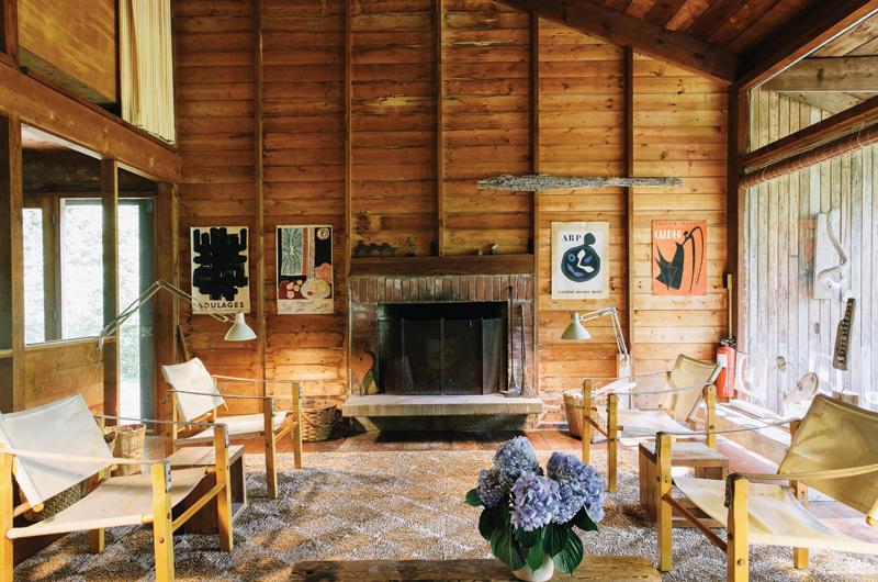
The Vineyard home they built a year later was best described by their son as “a refined summer camp,” albeit one with a modernist twist. Nestled on a wooded site, it is compact and efficient, made of simple materials by Island craftsmen, and defers easily to the surrounding environment. In a nod to vernacular New England architecture, Noyes used white trim on the building’s cedar siding. Its rectilinear plan based on a five-foot-square module was determined by the size of the bathtub placed at the center of the house. He designed it to be two stories to accommodate more sleeping spaces at a reduced construction cost, a necessary condition given the family had just completed their more substantial off-Island home.
As simple as it is, the summer house still demonstrates several of Noyes’s signature design features, such as the separation of public and private spaces and the use of solid exterior walls setting off transparent walls to balance openness and privacy. Similar to the New Canaan courtyard, the Chilmark house has a sizable outdoor room, in this case a lengthwise exterior porch extending out from the large living room. The Vineyard furnishings were purposefully less precious than the Connecticut home, which sufficed for the intentional back-to-basics living experience. Not intended for year-round use, or even a high-end Edgartown-like summer experience, it was designed to be a minimal shelter at one with the outdoors, a place that would inspire its occupants to explore the water, woods, beaches, and all that the Island offered.
Like the New Canaan house, the summer home also retained personal touches. Among these were Noyes’s own painted studies of Menemsha Pond, a variety of posters by his modernist design colleagues, and several amusing caricatures depicting family members at play by the famous New Yorker cartoonist and frequent summer guest Robert Osborn.
As always, Molly was an integral partner in the process of creating the home in Chilmark. “She supported the idea that [their summer home] was to be a spirited house, one that was not based on refinement, that had a nice rough sense to it,
easy to change and move things around, a light spirit,” said Frederick, “the spirit of the Vineyard summer.”
She also facilitated the family’s social life, which was replete with gatherings of modern design practitioners and devotees, including two important couples, Vibeke and Erik Simonsen and Talbot and Claire Rantoul, both of whom commissioned Noyes to design homes for them on Martha’s Vineyard.
The houses that Noyes eventually designed for the Simonsens and Rantouls, as well as another family, the Prestons, each represented a more refined version of his residential genre and showed how he could apply his consistent design vocabulary to satisfy his clients’ needs. There were similarities among the three. Notably, they all had open lots and water views, which drove much of the overall design. Because these clients were able to afford more than his own family could at the time, Noyes was able to bring back the more costly pavilion-style plan that he had explored thoroughly in his New Canaan houses. Each of the three houses had dramatic vista-capturing window walls framed by solid load-bearing walls. On the Island, Noyes used opaque cedar to create these solid walls. His characteristic open and
void design provided much-needed cross-ventilation while also connecting the occupants with nature. He designed each house with free-flowing plans and few interior walls, while at the same time he continued to delineate public and private spaces.
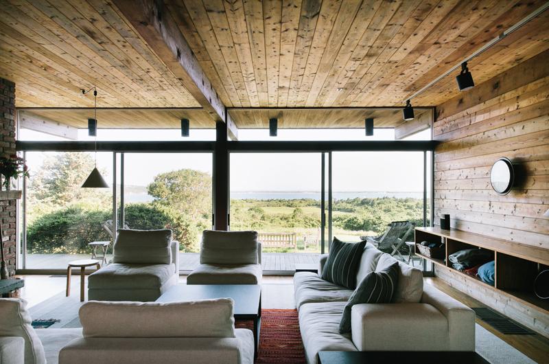
Although the three houses shared certain traits, they were customized to take advantage of the their unique sites and family needs. The Simonsen house, built in 1959, sits on a bluff overlooking a 180-degree view of Menemsha Pond. To capture this expanse, Noyes created a pavilion-length window wall that wrapped with mitered glass panels around to the side elevations. He connected the inside living area to the outdoors with a porch that traverses the length of the pavilion along the glass wall. A sweeping porch overhang served to shield the interiors from the afternoon sun and transformed the space into an outdoor room.
Although all of the Vineyard houses were designed strictly for summer use, Noyes included fireplaces and basic heating units to ward off an occasional chill and extend use beyond the short summer season. In the Simonsen house an exterior breezeway separates the private bedroom/bathroom wing from the public living area. In New Canaan, the Simonsens owned an influential Scandinavian design and furniture store, and Vibeke decorated the interiors using a variety of Danish and other modern pieces that were well-scaled to the space, which produced a feeling of casual sophistication that still reads as such today.
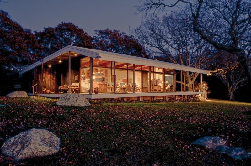
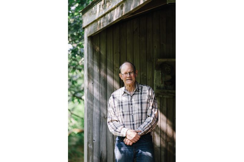
Working with Noyes’s son Frederick, the Simonsen house has today undergone a modest expansion and full winterization. “My design problem was how to change the house and keep the nature of the house and not make something that was radically different from the way it was conceived,” Frederick explained.
To increase the usable indoor space during the cooler off-season months, the Simonsen family wanted to enlarge the kitchen, dining, and bedroom spaces, and to create an interior connection to the bathrooms. Frederick suggested increasing the size of the overall building by adding to the original plan one of his father’s predetermined modules, which opened up the kitchen/dining area without disrupting the overall design proportions. He then covered the outdoor breezeway to give indoor access to the bathrooms, and made the bedrooms bigger by enclosing part of their outdoor bays. A clever scheme to minimize and hide the mechanical systems needed for winter living completed the process. Today, the Simonsen house retains the quiet modern elegance that was his father’s intention.
The Rantoul house, designed in 1964 and published a year later in an ample spread in Life magazine, was a more developed design than Noyes’s own summer shack. Yet it too demonstrated his signature simplicity and functionality. Living in a modest home was an important goal of both Noyes and the owners. “If we had, say, the Mayhew family (or other local families) over to the house, we’d be talking about our house as fitting in with the Vineyard style of houses, the up-Island style of the day,” said Neal Rantoul, who shares the home today with his sisters. “Much more rustic, subsistence-like, or basic: the Chilmark aesthetic.”
The Rantoul house was essentially a modern tree house. The site was a steep hillside over which Noyes cantilevered his signature pavilion, holding the back of the house aloft with slender piloti columns. From the rear the house seemed to float in the trees. He captured its more distant water view again with an expansive window wall and porch, but in this case the porch wrapped around the entire house. The front of the house is where the pavilion touched the ground, but at the door-less entrance Noyes created an exterior walk-through so that on arrival one could glimpse the water view beyond.
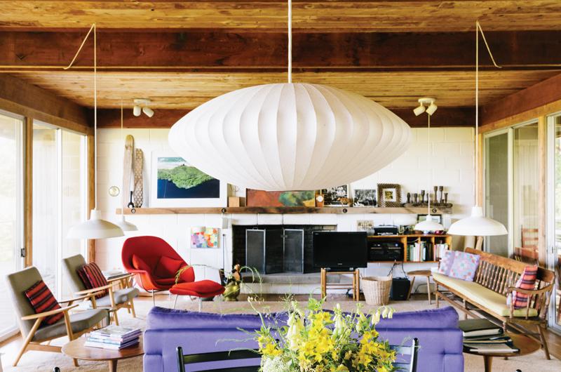
The exterior wraparound pathway was also the only way family members could get to their bedrooms and bathrooms – again, Noyes’s way of forcing engagement with nature. The structure on the Rantoul house was very simple, exposed, and made of rough-hewn materials. The house had many inventive built-ins, including convertible beds in the children’s rooms that hoisted up to let the space convert into a painting studio. Claire Rantoul, who was an artist, worked with Vibeke Simonsen to decorate the interiors, combining simple, modern furnishings with bright Marimekko fabrics and a variety of personal pieces that resulted in a lively interior. An avid gardener, she also designed a structured garden at the entrance of the home, which provided a welcome foil against the wilder landscape that surrounded the rest of the property.
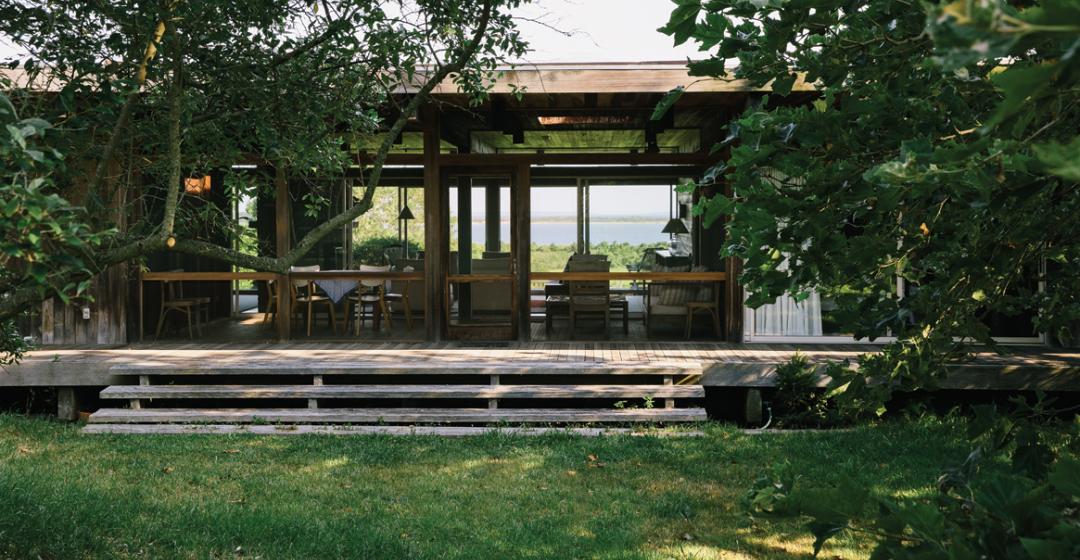
The last house Noyes designed on the Island was for the Preston family in 1969. In keeping with the progression of houses, it represented a more mature solution for his residential design and reflected a trend toward a more acculturated way of summer living, even in Chilmark. Notably, Noyes designed the house from the onset with its bed and bath wing under the same roof as the living spaces, a clear departure from his previous work. The house is a long pavilion with a window wall opening to the porch and view. Noyes also designed a sizable screened-in porch at the entrance of the home, a transitional space that mirrored the size and shape of a living room, but took away the seamless indoor/outdoor flow on one side of the house.
This design may have been a practical nod to the presence of mosquitoes, which for many people can limit connectivity to the outdoors anywhere around Menemsha Pond. Another unique feature of the Preston house was its central fireplace, which Noyes used as both structure and as a room divider to separate the dining room and kitchen from the living room. This clear delineation of room function also suggested a more formal off-Island way of living that in previous decades would have seemed too fussy for summertime. “By the ’60s,” as Frederick put it, “the Vineyard had changed its nature. And so [the Preston house] was less of a camp and more of a house. Still, it was something sublime, giving deference to the view of Menemsha.”
Even with its subtle refinements, the Preston house is so distinctly simple and modestly scaled that it exudes the ethos of mid-century modern design. It too is now undergoing a restoration by Frederick, who promises to stay true to his father’s design while incorporating a new kitchen for the current owners: his sister Derry Noyes Craig and her family. The house will not be enlarged beyond its original footprint, nor will the family build into it any of the contemporary upgrades (a gym, wine cellar, screening room) that many homebuyers seem to require today.
In fact, some might consider a simple restoration of any of Noyes’s modest homes a folly, given the value of the land on which they sit. And considering development trends on the Island, their long-term fate is, in fact, precarious. But as seen in Palm Springs and a growing number of places throughout the world, mid-century modern buildings and objects are becoming more valued both as historic resources that serve to embody the Zeitgeist of the American postwar experience and as extremely desirable places in which to live. Noyes’s modest homes with their minimal disturbance on the earth also represent a kind of environmentalism that is once again of interest to cities and people working to preserve and equitably share diminishing natural resources. In describing the contemporary use of her home, Noyes Craig may have put it best:
“The use of glass makes this house light, transparent, and non-imposing. And it is very much a part of the landscape,” she said. “The house is low and hard to see from the pond. But from the inside the view of the pond is spectacular. Can’t wait to get back there. It’s the most peaceful place to just be with nature.”
Though the fate of the Noyes houses on the Vineyard may be unknown, while they are still here it should behoove architects and builders to examine the lessons these well-scaled experimental gems demonstrate, along with the lessons they might teach us all about future building on the Island.



 4 comments
Comments (4)